When homeowners undertake a whole-house remodel, they knowingly sign up for a big, lengthy project. Sometimes, however, they do not realize the extent of work necessary to truly transform the property into their dream home. Remodelers often must take the house down to its studs, and an especially challenging site can present obstacles that complicate their execution of the project.
Curb appeal becomes another important consideration for companies who take on a whole-house makeover. Not only should they contemplate how the home will look from the outside, but they also need to think about how its entryway functions for the inhabitants while still being inviting to guests. The entrance sets the stage for the project and introduces them all to a new experience.
Each of the winners in our annual Master Design Awards for a whole-house remodel more than $700,000 confronted a lackluster entryway. They improved the entrance with thoughtful design and created a more welcoming approach for the family as well as visitors. Their solutions offer other remodelers an example of how they can successfully enhance a front entry for their clients.
Bridging Across
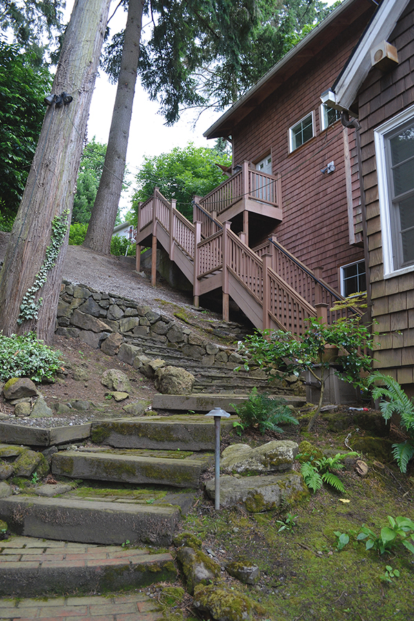
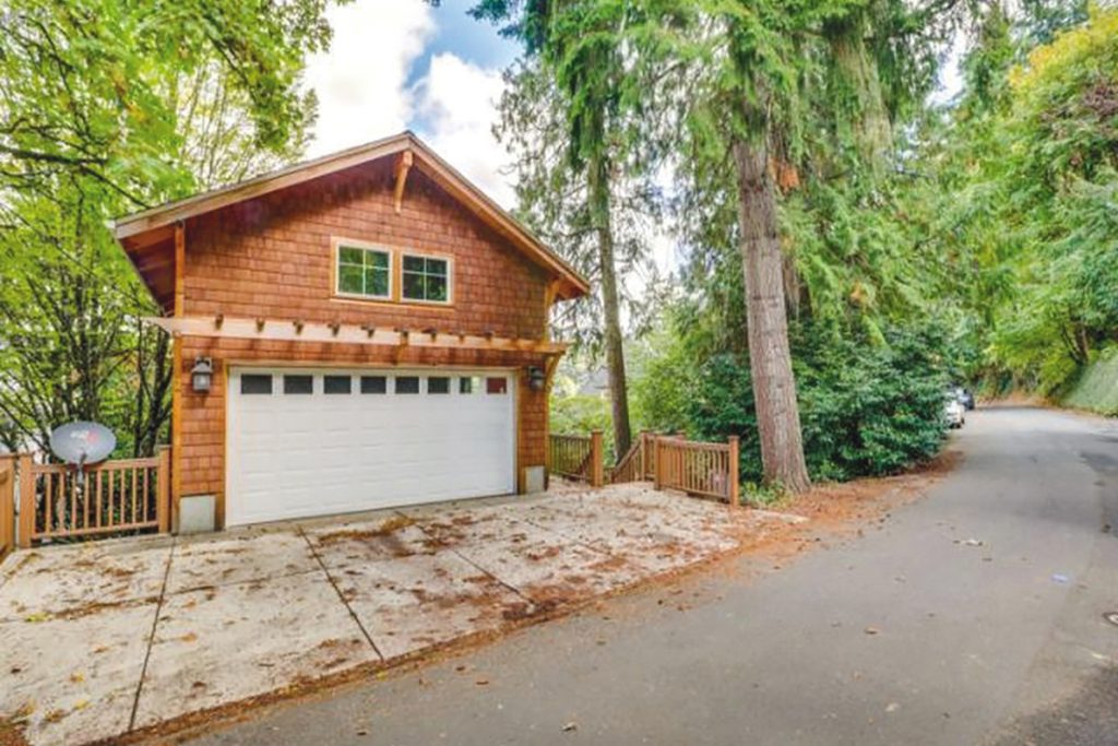
After buying a home on Lake Oswego, the owners wanted it to be drastically different (i.e., more modern) than their Tuscan-style residence in Medford, Oregon. The lake house, perched on a site 30 to 40 feet below the street, terraced down but did not maximize views of the surrounding area. Entering from the front, moreover, required people to navigate down a winding path of obstacles.
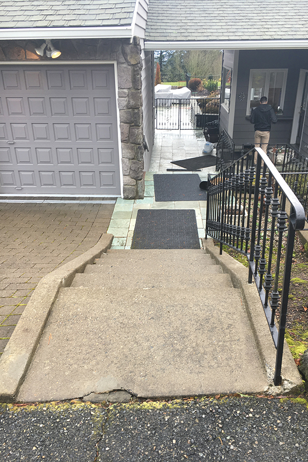
“The only thing you could see from the street was the garage,” says Jake Weber, AIA, a principal of Giulietti Schouten Weber Architects in Portland. “The main living level was down like a flight and a half of stairs. It was probably a good 10 feet or more, and you also had to go down these old, slippery deck stairs that were exposed to the elements. It wasn’t very inviting; if you didn’t know exactly where you were going, you would think that you’re not heading in the right place.”
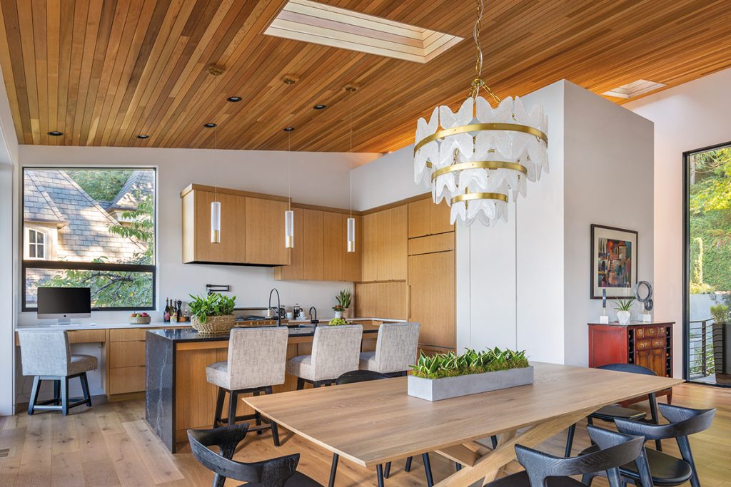
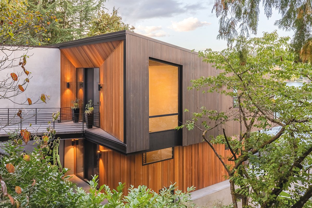
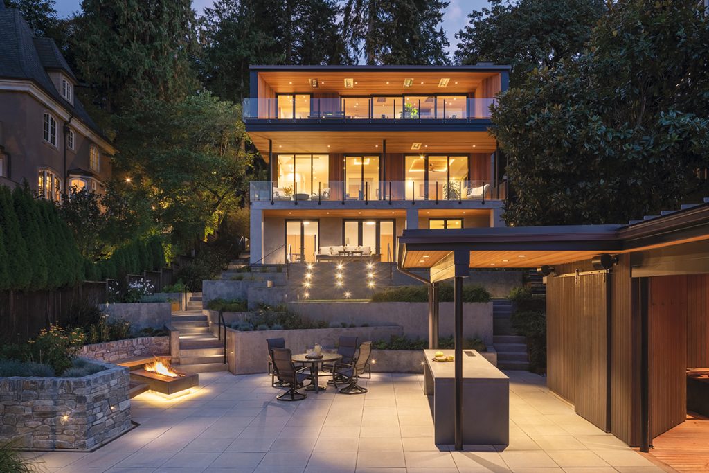
Because of the tight setbacks between properties, the firm could not expand the existing footprint to create an open floor plan. It utilized 3D modeling to develop the building volume despite strict and complex zoning requirements, which limited heights and volume planes. Shaped into offset boxes, the three-tiered plan satisfied side-yard zoning meant to prevent single-plane wall masses.
“We knew we had to be more vertical and couldn’t really expand horizontally—even side to side or front to back,” Weber notes. “We had to play with how to differentiate the levels, so it didn’t look like a tall tower that was obscure in the line of homes along the lake and didn’t look out of scale. We had to break up and cantilever each of the levels, so it didn’t look like a tall rectangle.”
The tight lot, steep terrain and rocky soils made the remodel a difficult build; for easier access to the site, Riverland Homes barged in a lot of materials and equipment by boat on the lakeside of the property. With virtually no parking and no turn-around at the end of the street, large delivery trucks and hauling equipment had to drive in reverse when they exited the narrow, half-mile lane.
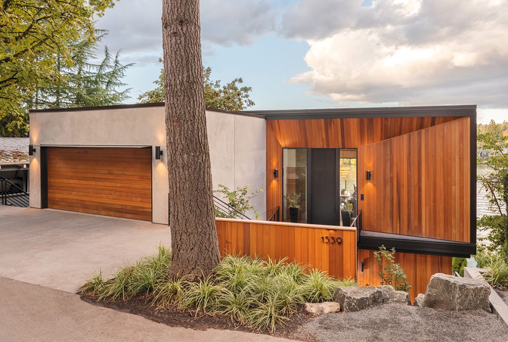
To improve the entry to the house, the company erected a bridge that spans from the street and driveway to the front door. This approach allows direct access to the top level of the remodeled home and reveals uninterrupted views of the lake beyond. The grade still falls quickly down and away from the street, but now the owners have street-level access to guide visitors into the house.
“In our new concept, the main level is higher; it’s up maybe a half a flight now below the garage instead of a full flight and a half,” Weber explains. “We were able to essentially bridge from the driveway to this new upper level, which opens to the incredible view, and you’re immediately in the great-room space with the kitchen and dining/living rooms. That’s the main entry for guests.”
Originally intending the lakefront house to be a weekend home, the owners ended up selling their Medford residence and retiring there to live full-time. “They really love the functionality of it,” Weber says. “It allows them to entertain and still have their grown kids over and stay with them.”
Functional Welcome
Two busy professionals involved in their children’s schooling and activities sought an open space that would be a gathering place for both family and guests. Their aging, ranch-style home sat on an expansive corner lot with beautiful oak trees. Small, single-pane windows in different styles and competing roof lines, however, produced awkward angles and an overly busy appearance.
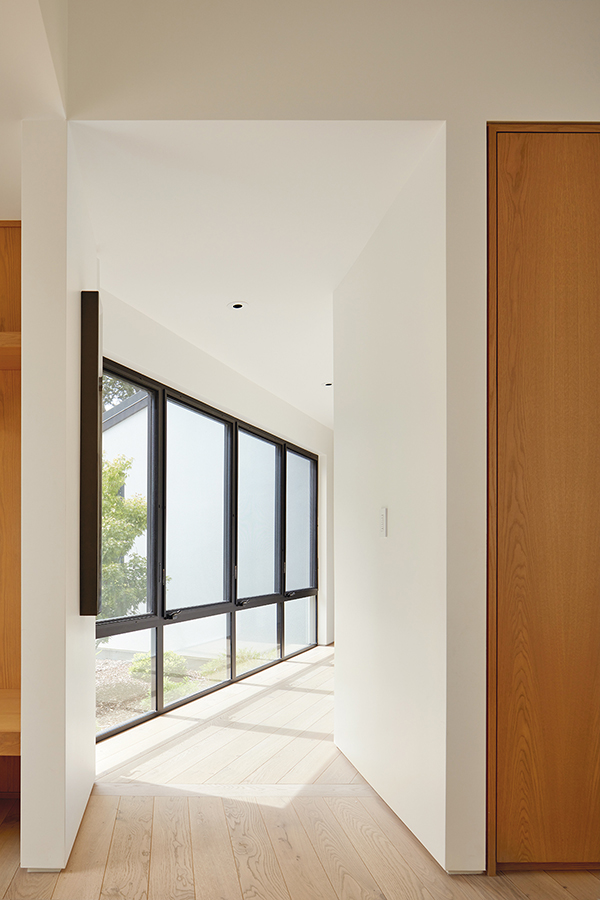
Floor-to-ceiling windows (left) draw the eye down a light-filled hall from the foyer.
“The house has three wings, but the living spaces were so inefficient that it felt much smaller than it actually was,” says Hieu Dinh, a project engineer for Earth Bound Homes in San Jose, California. “It was one of the oldest houses in the neighborhood and had weird ceiling slopes; there were a lot of missed opportunities. But the architect did a fabulous job of re-laying it out.”
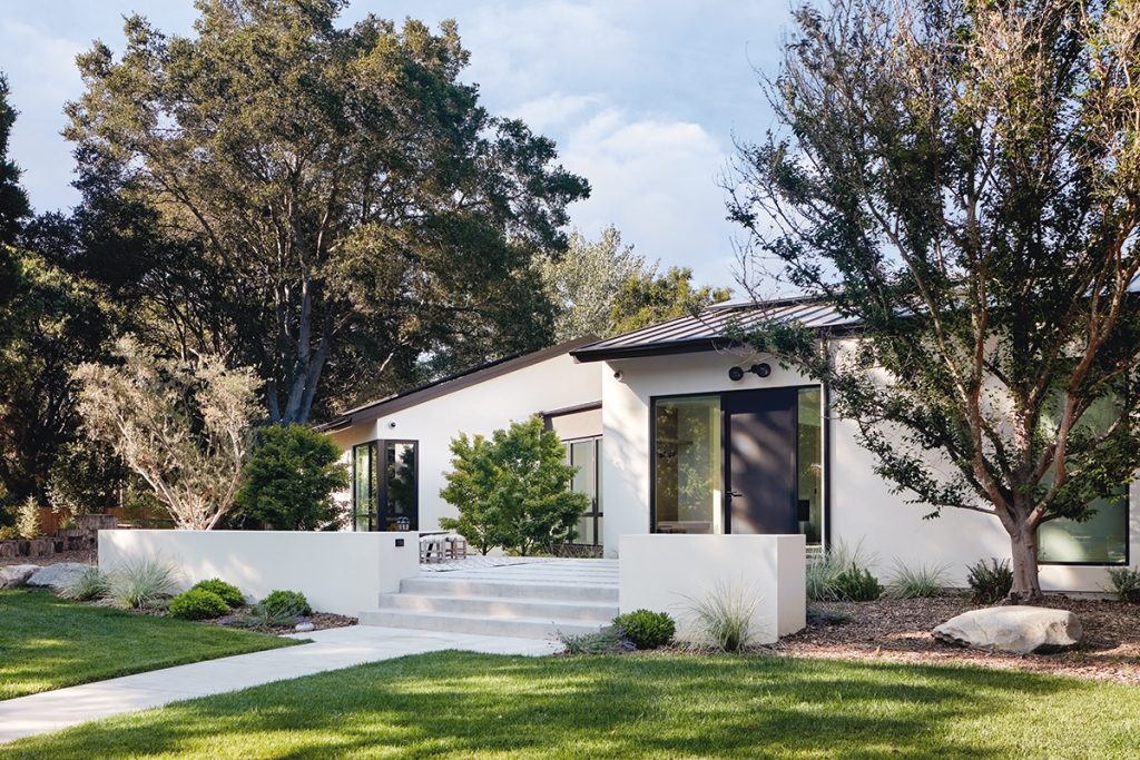
Feldman Architects increased the square footage to eliminate the disjointed angles and create an aesthetic yet functional home. The new, standing seam roof establishes that contemporary look and will be less likely to leak in the future because of the hidden fasteners under its roof seams.
A light-colored stucco covers the exterior envelope of the entire house for a sleek, elegant finish.
“We kept the foundation, so the outline footprint is basically the same,” Dinh notes. “[But] even though we had the basic outline footprint, there were some foundation changes to square things off. With how the planes are laid out, it had to be exact, so that when multiple planes of a space [both old and new] meet together, it ends at a point—and not some weird, overlapping junction.”
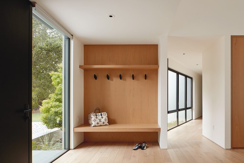
An existing, awkward front entrance landed family and guests in the middle of the living room as they walked through the door. It also did not provide much-needed shoe, coat and hat storage to the inhabitants, who are a “no shoes in the house” family and wanted a place to sit while putting on and removing their shoes each day. The front entry had to be both welcoming and functional.
Large, stationary side windows now bring in natural light to replace the old, leaky skylight that was removed. An espresso-colored slab door supplies a visual anchor against the light-colored wood flooring and a built-in bench and shelf. Modern-style coat hooks sleeken the custom wall unit, and the European oak flooring institutes a consistent and visual flow throughout the house.
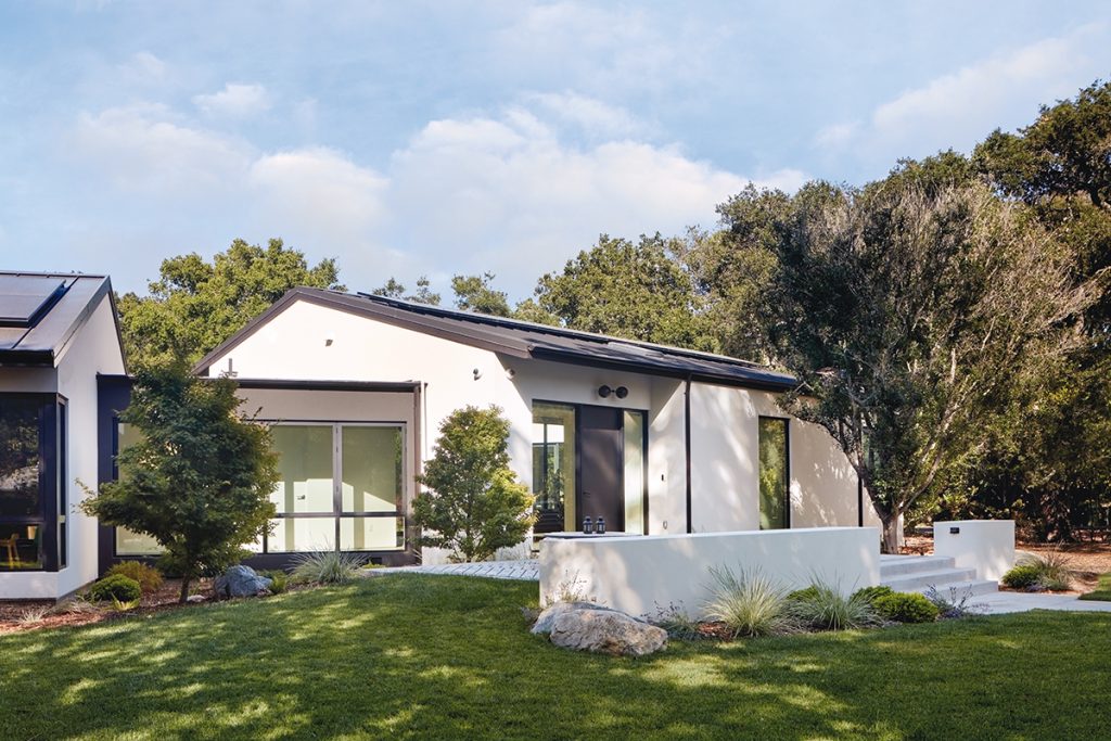
“The property is a corner lot, so there are two streets,” Dinh explains. “It has a lot of oak trees and a deep front yard. The front yard is fenced now, and the entryway is far enough away from the front fence that it has privacy, even though there are windows all around the house that don’t have shades or are left open all the time. By nature of the site itself, the house is able to do that.”
With the addition of the foyer, the company squared off and built an addition on the living room and were able to capture substantial wall space for a dramatic Tadelakt-clad, horizontal fireplace, which includes two big, custom cabinets on either side with hidden storage for games, books and toys. Stackable sliding doors provide abundant light and can open fully for indoor/outdoor living.
“You don’t know it feels private when you’re inside the house, although you can take a picture on [the outside] and see everything inside,” Dinh says. “It can only be experienced by living inside.”
Key Link
A couple of high-energy doctors with two kids desired a fresh primary suite that employed larger windows and welcomed them home each day. They originally purchased the house because of its site, which overlooks downtown Portland. The design incorporated too much square footage and lacked cohesion, though, so the project evolved to include the main and upper level of the home.
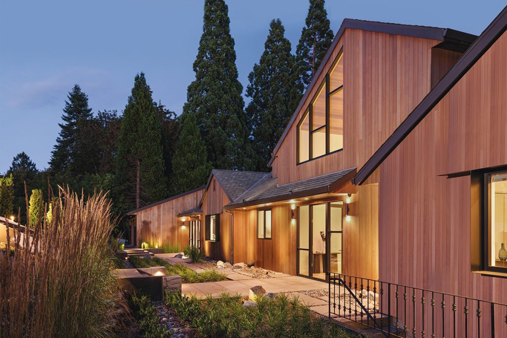
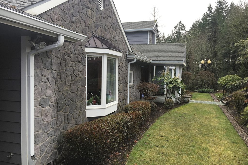
“They just had way too much square footage,” recalls Tim Schouten, AIA, a principal of Giulietti Schouten Weber Architects. “We ended up doing very little to the basement level and instead just concentrated on that main level and the upper-level bedrooms. The whole front of the house was almost chaotic with an elevation of differing gable forms and proportions; it was kind of a mess.”
The house sits lower than the street and requires a set of stairs for people to descend to reach the main entrance. A small, dark entry porch that felt tacked on to the existing home greeted visitors and drew attention to a stair tower. The firm did not want to change the roof line so much that it lost all gables, but a clean design would move away from the half-hearted attempts at Craftsman.
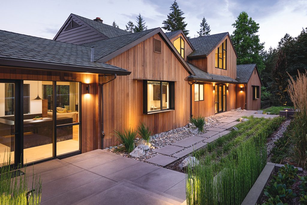
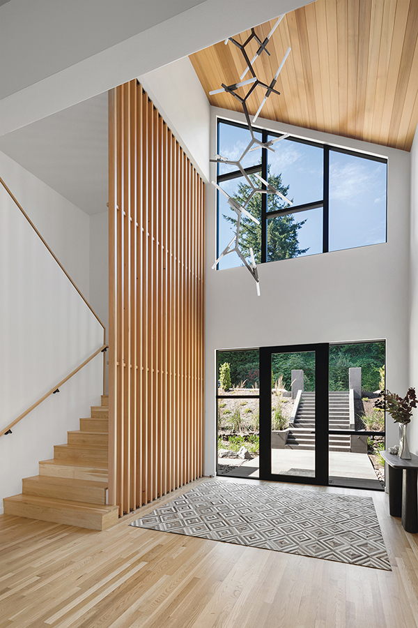
“We basically connected the roof together and got rid of the stair tower to the right, opening a big vault at the front entry door with some clerestory lights above that,” Schouten notes. “And that’s brought natural light all the way into the living room and made it a much more inviting approach. Cleaning up the front entry, and redoing the stair and tower, seemed to unlock a lot of problems.”
The firm pared down multiple gable dormers and complemented them with tall, angled window walls and simplified exterior materials. JDL Development installed a vertical cedar siding as well as the vertical window layouts with black steel accents to help create a more modern, streamlined front facade. A wood screen, slatted wall in the foyer provides privacy from the new wood stairs.
A detached garage on the left of the home led into an outdoor breezeway, and the family loathed going outside and down a narrow set of stairs to enter the house. When the father got home from work, he would sit down in the nook with his kids to review their homework as dinner was being prepared. Enclosing the outdoor breezeway enabled a mudroom between the garage and kitchen.
“It’s a very open mudroom; it’s kind of a non-mudroom,” Schouten says. “The coats are hung on the other side of where that little nook table is. It was built with a higher wall, but we decided it was closing it off maybe a little bit too much. So, we brought everything down, and the idea was that they would be selective with their coats and boots and not load it up like a typical mudroom.
“That mudroom nook also provides access to the backyard and the pool,” he adds. “It became a pretty key link between the garage and the main house—it had to do a lot of different functions.” QR